Happy Middle of the Holidays to you! I have something I'd like to share with you and I hope it works. Today, Oil Painters of America published an article I wrote about color charts on their blog. I will post the link at the end of this but I am going to try to copy and paste it to my own blog, so that you can read it if you don't subscribe to OPA's blog. You should, though. There's always something interesting for oil painters being discussed on it; you might enjoy it.
Okay, wish me luck, I'm cutting and pasting now:
The Value of Color Charts
December 1, 2014 by 8 Comments
My advice—my plea to you—is to do the charts for your sake. (Do not use mine.) The charts are not a sure-fire gimmick guaranteed to make you a color wizard, but they are the best way I know of to understand your pigments and enter the study of color on sound footing. Take your time; don’t be in a rush just to get them done. Stay alert and see what is happening, not only on your palette, but within yourself. Impatience will well up, so will exasperation as you make mistakes or struggle with decisions about the right color and value, but I urge you to stick with it. In a way, the charts are intended to be somewhat agonizing so that you will develop the patience and self-control so necessary in painting. It should be like an initiation ritual before what is to come, so you may endure it without giving up.
Richard Schmid, Alla Prima
Richard Schmid, Alla Prima
I begin with this quote because, seriously, anything that Richard Schmid pleads with his readers to do is worth consideration. The discipline of charting color might be compared to learning to read music or understanding grammar. I know some great musicians who play “by ear,” and writers who know nothing about the rules of grammar, but they will admit that they wish they had that academic knowledge in their hip pocket. Color charts are like that. You may not learn everything possible about color by doing them, but you will have, as Richard said, “sound footing” to begin your journey. You will also have confidence, knowing you’ve done your work.
The purpose of the charts is to show how each color on your palette relates to all the other colors there. You will want a chart for every color, to see how that particular color interacts with one other color, and then how their offspring look when mixed with white. Each chart will show the influence of the dominant color on the other colors. You will be able to tell by looking which color is represented in the chart; your red chart’s red/yellow will not look like your yellow chart’s yellow/red. You will add white as you go down, tinting each color until it’s all but white; across the bottom, all the lightest lights should be the same value. Most of the other colors start out at different places on the value scale, so the other rows will have a variety of values. Even though you can tell by looking, it’s still a good idea to label all the columns.
Here’s what you will need: ¼ inch masking tape (easiest to buy online; costs about $2.00), a pencil and ruler, one or two small palette knives (the second one can scrape the first, you won’t have to wash brushes between each color, and your squares will be pretty), and of course your paints, palette, paper towels and canvas. When I am teaching color, I start with four colors (plus white) in order to reveal the unlimited potential of a limited palette. This number of colors fortuitously fits perfectly on a piece of 14×11 canvas, which can be bought in tablets.
Materials
 Here’s how you prepare your canvas: It’s easier to work on a tabletop for this than using an easel. Tape the canvas to a board to allow yourself freedom to spin the chart around as you fill the squares. Measure out a quarter of an inch for the width of the tape, then an inch for each square, and repeat for every color. Make tic marks with your pencil, rather than lines, to indicate placement. Put the quarter-inch tape between the marks and leave a tag hanging off the end for you to pull when you’re done. Place all vertical tapes first, followed by all horizontal tapes. You will carefully remove the tape as soon as you are done with each chart (don’t wait till later!); it is easy to pull the horizontals off first, then the verticals. Now write the initials of the colors you will be charting. For example, the colors I use for the limited palette are Transparent Oxide Brown, Ultramarine Blue, Cadmium Red, and Cadmium Yellow Pale: TOB, U, CR, and CY. The Transparent Oxide Brown chart will have these headings on the columns: TOB, TOB/U, TOB/CR, and TOB/CY. Note that the size of your chart/canvas will be determined by the numbers of colors and values you want to explore. For the limited palette, I chose four colors and five value steps, so I will have four across and five down, plus some space between each chart. Measure it out accordingly.
Prepared Canvas
 Here’s how you create your chart: Understand that this is an exercise for your eyes, mind, body, and soul. It will demand your full involvement in a most personal way as you begin a real dialog with your colors. Give yourself lots of latitude, grace, and hours.
The order that the colors are laid out on your charts is a personal choice. Some people want the order of colors to be the same on every chart; others prefer that the dominant color leads on every chart and the rest fall in behind it. How you lay your colors out is a choice you make based on how you want to see your colors. To me, it makes sense to start with the dominant color, so I can see at a glance which chart it is. Then the other colors follow according to their value, so that whether reading across or down, they start with dark and move toward light. Lay yours out in the order that makes sense to you.
Allot a nice big pile of the color you’re charting on the palette and another pile of white. Your first color is always the easiest, as you only have the one color, plus white. The square you fill first is the top left one— pure, untinted, unmixed color. The second one you’ll mix is the last box on the column; it is nearly white. To mix that, start with a pile of white and add just the tiniest spot of color to it. All the bottom boxes on your chart will be the same value: nearly white. The value of the other squares will be determined by the value of your master color.
You will be working one column at a time, taking five value steps with each color. The first column of each chart is the master color’s value scale. All the other columns will show this master color’s effect on the rest of the palette’s colors. Here is the first column for the limited palette chart:
First Color Column
 When you have your first and last colors laid in, you will mix the value that is right in the middle of those two. Mix it and hold it on your knife over the two color values on your chart and ask yourself which it favors more, the pure color or the lightest tint. This is when your colors really start talking to you. When you finally mix a color value that favors neither, you have your middle square. The last two colors are halfway between each of these: one is halfway between pure color and middle color value, the other is between middle color value and lightest possible value.
The next column will be a little bit more complicated, as you are adding another whole dimension: you’re making not only value decisions but also color decisions, as you mix color columns that show two colors in which one dominates the other. It should be clear on each chart that you’re showing a certain color as it’s influenced by other colors. You then create the tint steps in the value scale for each.
First Chart Before and After
As you are working, remember that this is your chart and no one is timing or grading you. Let it be a joyous experience, with not one nerve wracked and nary a tear shed. Scrape your mistakes and don’t worry about the squares; your tape is in place to keep you tidy. You will be so surprised when you pull the tape off and see how beautiful your work looks. When I first finished mine, I put them on my studio wall because it was just so satisfying to look at them; like a lovely rainbow of harmonies. But they had to come down. They are a tool, and just like the tools on the pegboard, they have another use besides looking pretty on the wall. I use them for teaching and for note-taking in the field. A good field sketch combined with informed color notes is invaluable back in the studio.
A good field sketch combined with informed color notes is invaluable back in the studio.


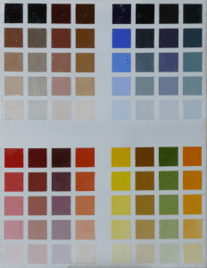
Limited Palette Color Chart
When you’re finished with all your color charts, you may want to varnish them after a few months to ensure their long life. You can keep them with you as loose canvas pieces or cut them out, hole-punch one side of them and put them in a binder, or you can just keep them in transparent sleeves. When you want to add a new color to your palette, it is good practice to create a new chart for it, to see if it can play nicely with your other colors. Some very nice colors are too weak or too aggressive to fit in with the family. Subjecting them to the scrutiny of the chart is a quick qualifier for contenders.
 It’s easy to see how your mind and eyes are challenged by the creation of color charts, as all the measuring is intellectual and visual. If you try to literally measure part-for-part, you will not have an accurate chart because every pigment has a different saturating power. So, your mind and eyes are about to get smarter. You will not find how it challenges your body until you start the process. You will then be amazed at how physically demanding this assignment is. This isn’t for sissies. And as for the soul… ultimately your choices, as objective as this process seems, will be determined by how you feel. It can’t be taught. You will only get it when you do it. This is why charts must be done and not just seen. It’s also why the color charts vary between different artists, and why Richard Schmid can say that he learns something new every time he makes a new set. He is still making new charts for himself! And since he’s been painting longer than a lot of us have been breathing, perhaps it really is a worthwhile thing to try.
It’s easy to see how your mind and eyes are challenged by the creation of color charts, as all the measuring is intellectual and visual. If you try to literally measure part-for-part, you will not have an accurate chart because every pigment has a different saturating power. So, your mind and eyes are about to get smarter. You will not find how it challenges your body until you start the process. You will then be amazed at how physically demanding this assignment is. This isn’t for sissies. And as for the soul… ultimately your choices, as objective as this process seems, will be determined by how you feel. It can’t be taught. You will only get it when you do it. This is why charts must be done and not just seen. It’s also why the color charts vary between different artists, and why Richard Schmid can say that he learns something new every time he makes a new set. He is still making new charts for himself! And since he’s been painting longer than a lot of us have been breathing, perhaps it really is a worthwhile thing to try.
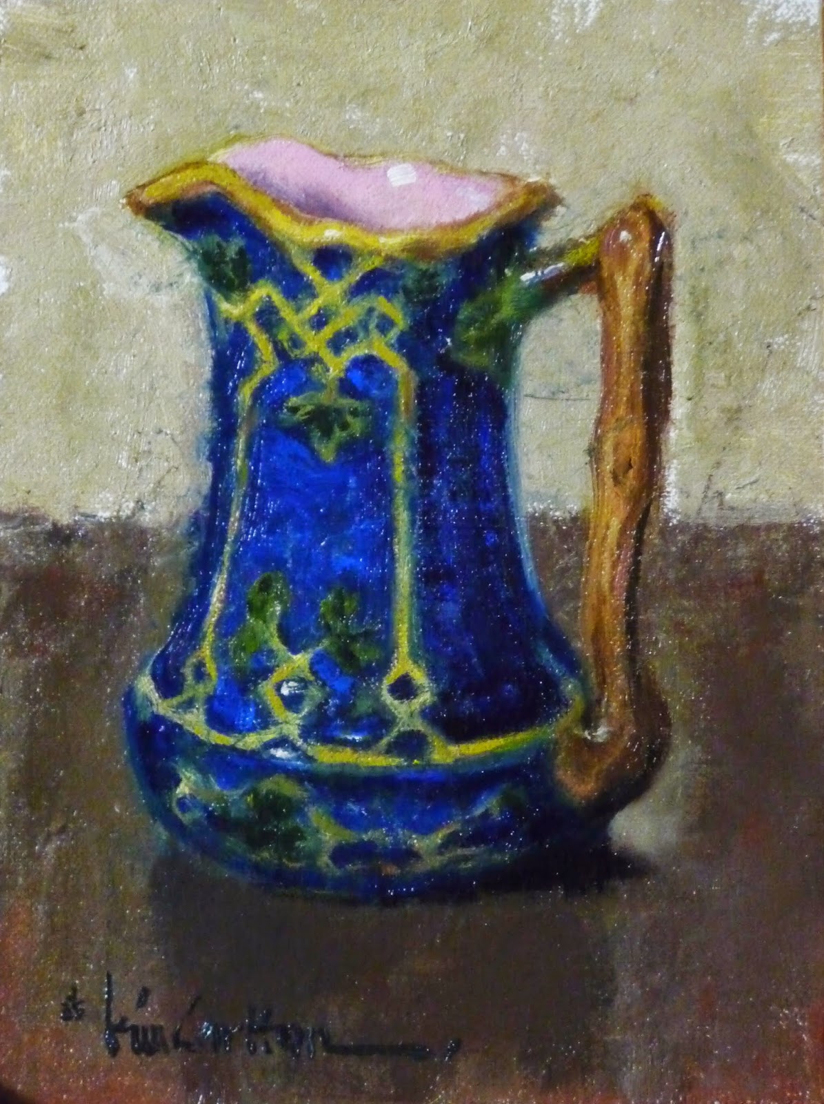
kimcarlton.blogspot.com